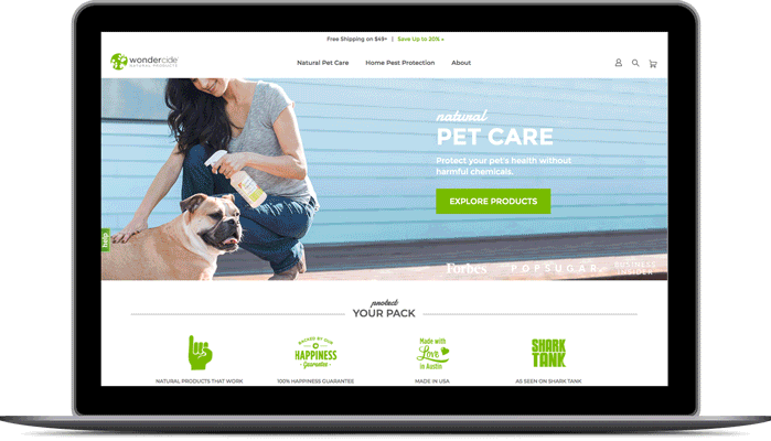
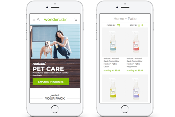
Lifestyle photography was the driver of the look and feel for the site overhaul. Since Wondercide's patrons are largely active in their pet's health and wellbeing, the visuals needed to clearly convey the pet-owner bond.
WEBSITE STYLE TILES
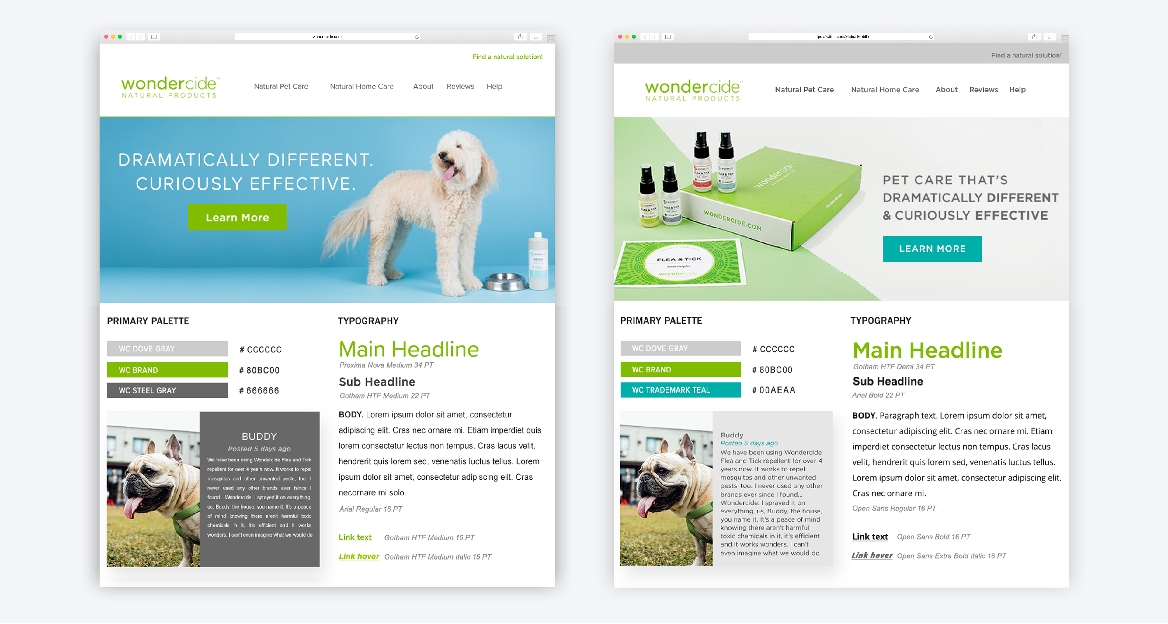
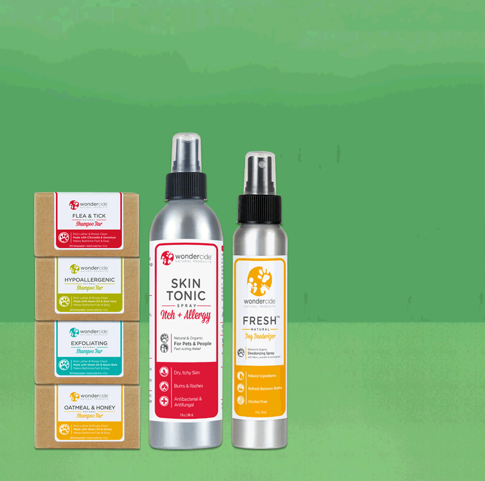
The Wondercide rebrand was never meant to stray far from the company's heritage green and soft sans serif typefaces. Using visuals from a recent shoot I designed these pages to deliver on the strategy to evaluate product vs. pet-focused visual hierarchies.
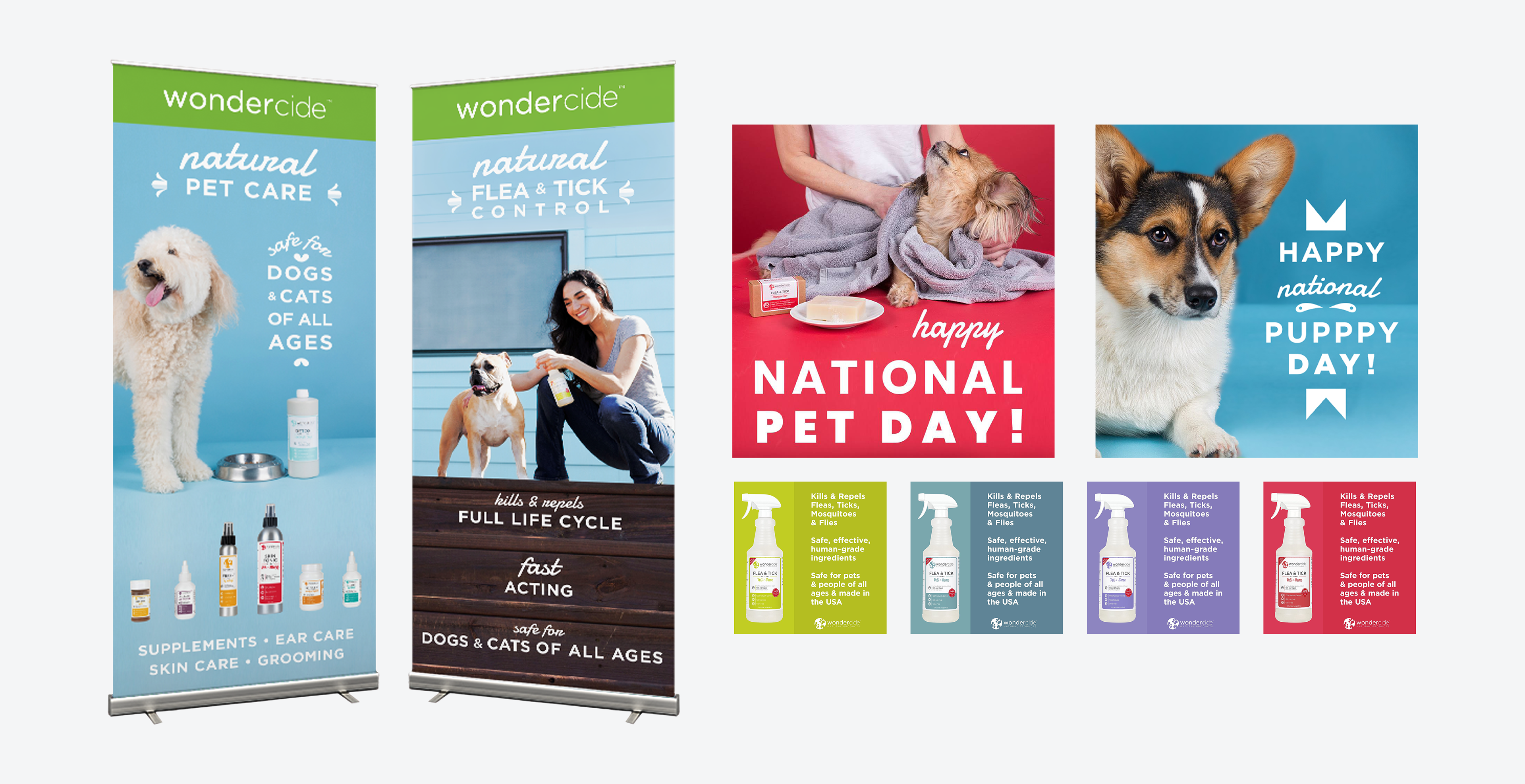
Wholesale and retail application of visual expression around the depth of pet-owner relationship, social promotion, and Amazon enhanced product images.