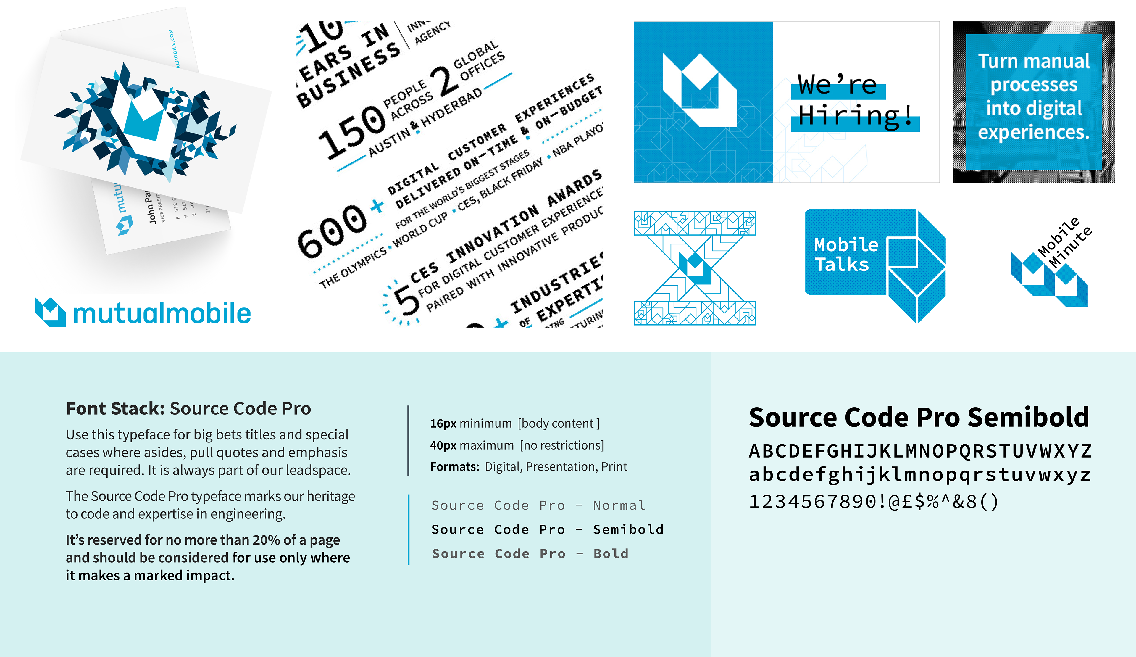
The logotype was the token item I had at my disposal when building Mutual Mobile's visual brand. In order to bring our pillars of integration, collaboration, and movement to life, I reconfigured the mark in patterns, leveraged more minimal accent approaches within collateral, and constructed interlocking patterns and shapes to tell a more tangible mobility story.
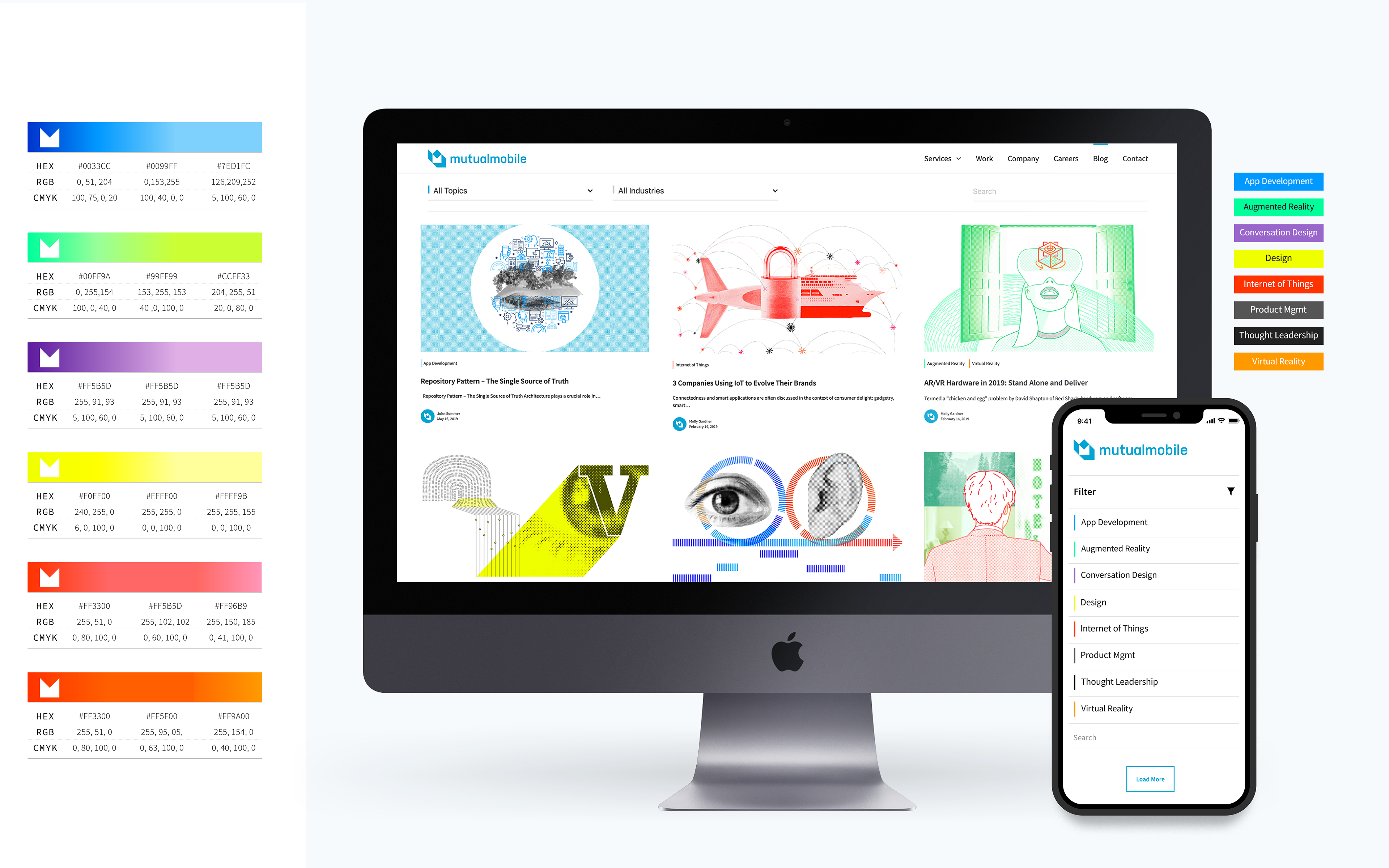
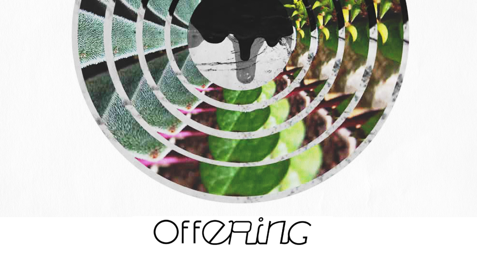
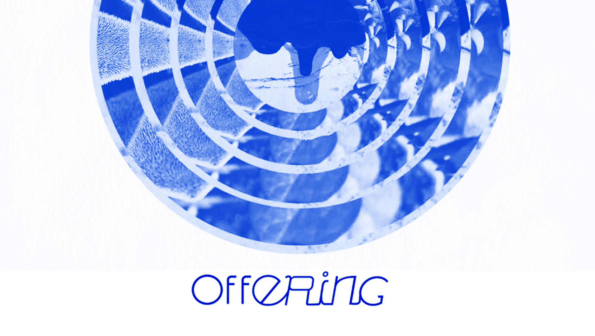
In order to create identity and distinction for our capabilities, I developed a secondary brand language, leveraging tag colors. For future activation, shades were built up to brights and neons in the RGB space. Additionally, these color systems expanded into monochromatic palettes tied directly to the relevant service offerings. With a limited brand awareness in the market, these colors aided in consistency and recognition.
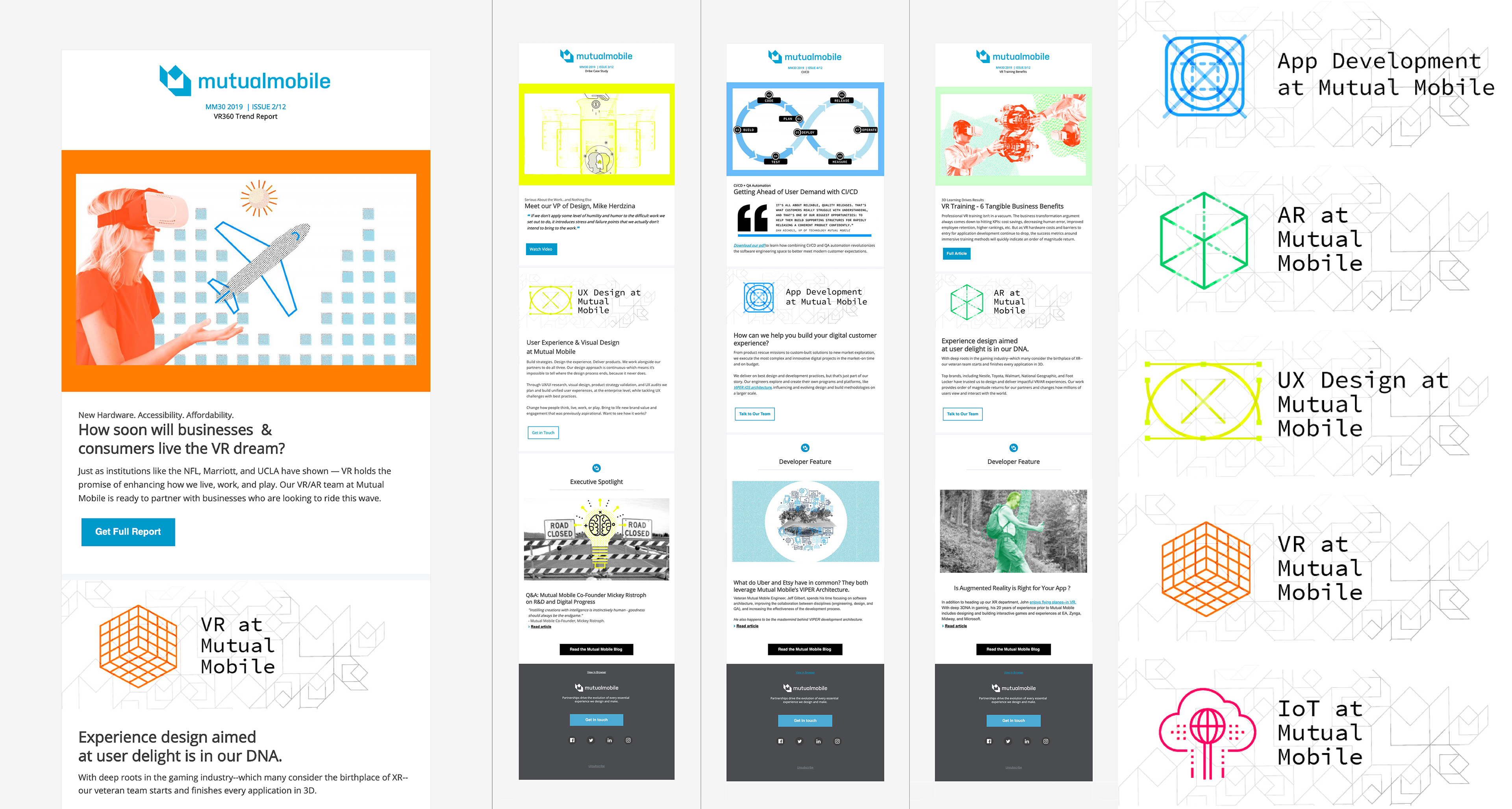
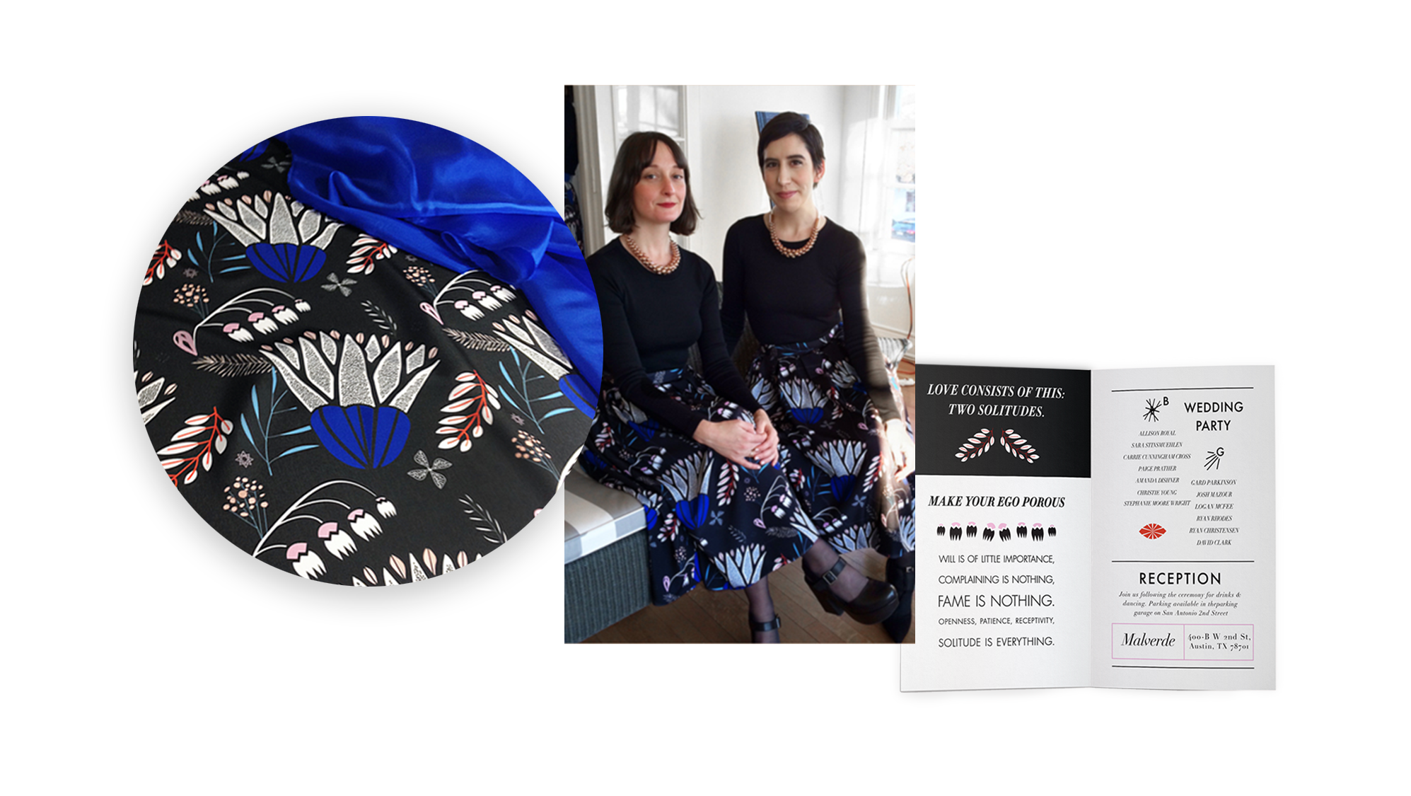
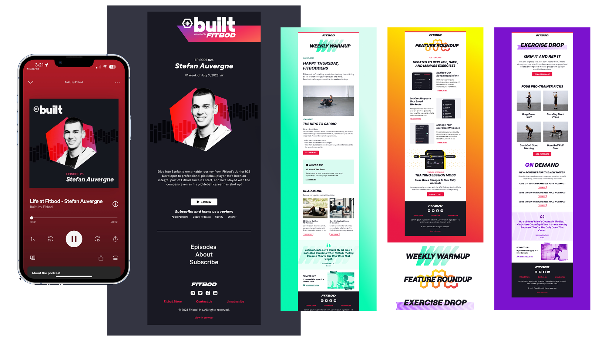
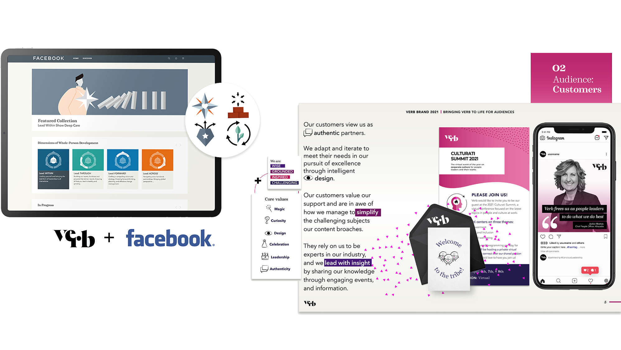
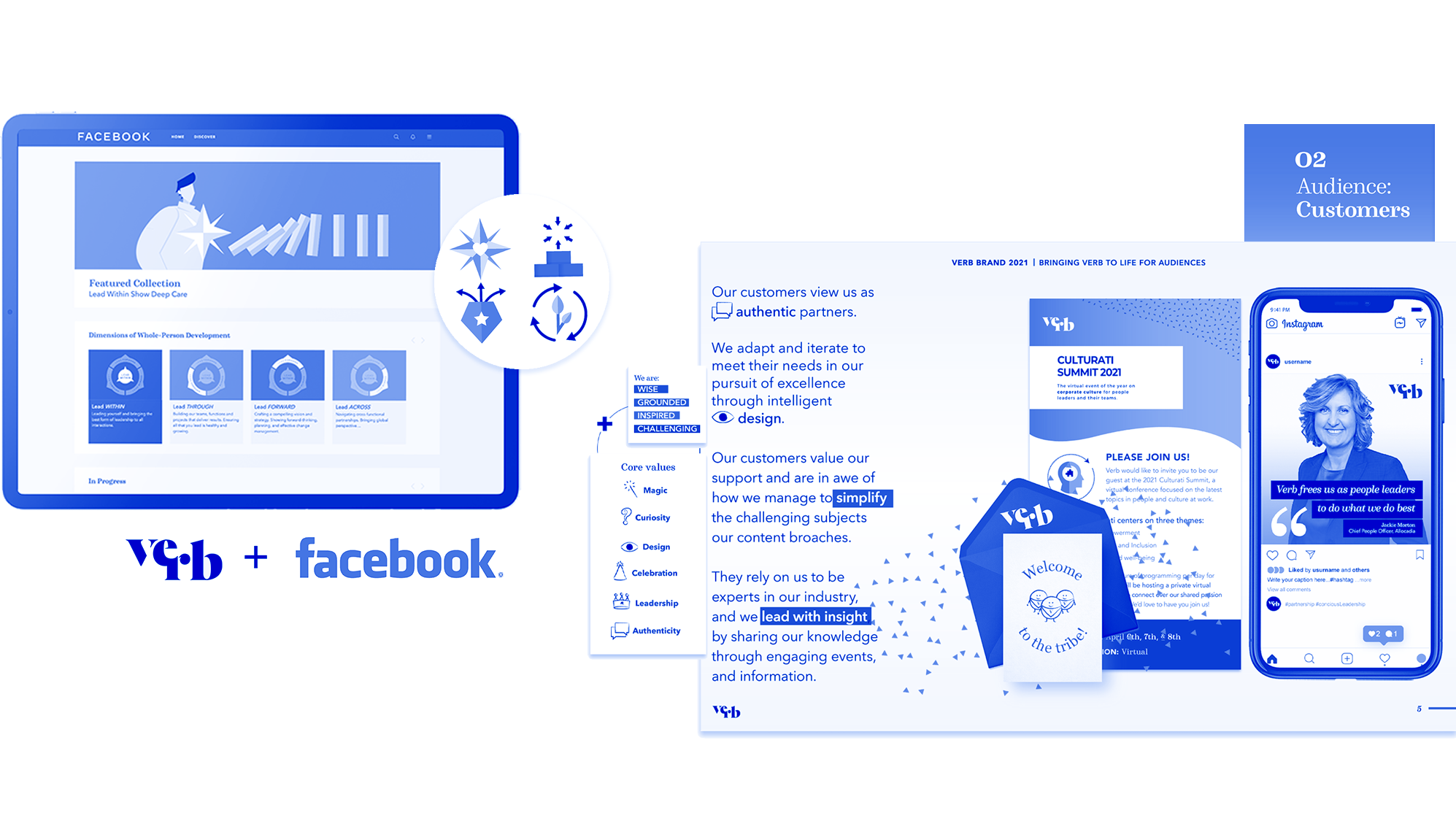
Application of service offering color stories to newsletters.
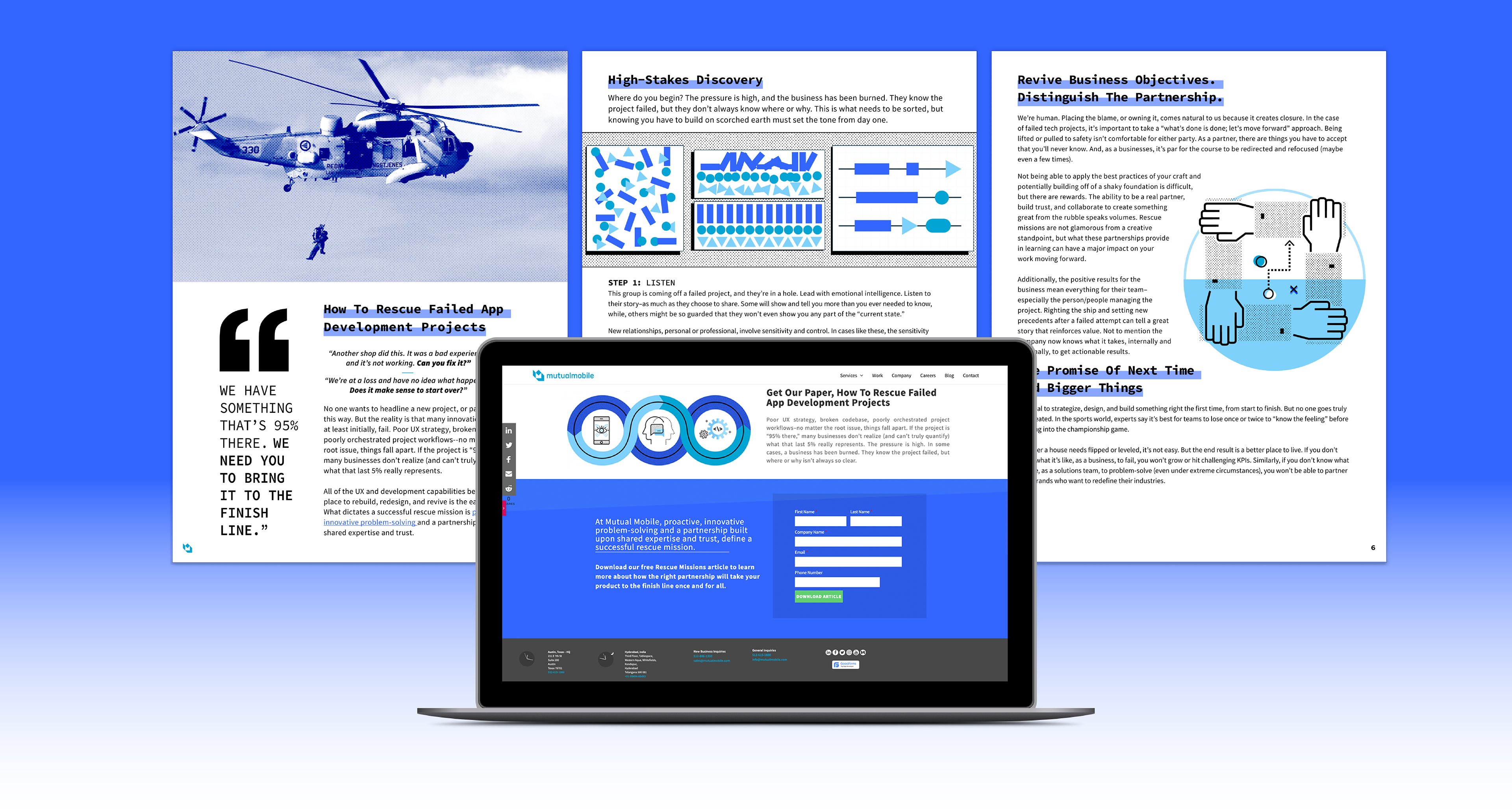
With heavy emphasis on lead generation campaigns to support sales team goals and generate conversations, I created a landing page experience highlighting our 'Rescue Mission' feature content piece. The page utilizes the Z-Pattern layout, ending with singular focus on the CTA. This helps drive prospect engagement and encourages download action.